Optimizing Website Performance to Improve SEO Rank
Published: August 22, 2020

By Anthony
11 min read
Wondering why your website's SEO ranking is constantly changing? Google is constantly tweaking their algorithm to improve search quality. Some of Google's most notable changes include filtering out low quality sites, favoring mobile optimized sites, and down ranking sites that artificially increase inbound number of links. Google recently announced that page experience will impact SEO rankings as well. This web.dev goes into more detail on what contributes to a good "page experience" but the main theme is around performance and load times. Today, we'll be taking a look at the changes I made on my site to account for these changes.
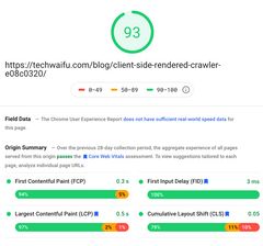
Google's algorithm is a blackbox so we don't know for sure what signals Google uses to rank your site, but three metrics Google will take into account include Largest Contentful Paint, First Input Delay, and Cumulative Layout Shift.
People don't like to wait in general. This applies to website load times as well. It has been proven that longer load times contribute to higher bounce rates too. Hence, Google wants to quantify site speed and favor sites withoptimal load times.
This metric is essentially how long it takes to paint what Google considers the main content on the page.
For example, if you're loading up an article and the article has a title, an article image, and some text, Google might consider the most contentful item as the article image. Currently, Google only looks at certain items on the page.
You can analyze your website on PageSpeed Insight to see what Google considers the "contentful object".
FID is the time it takes for your site to respond to the first click on the page.
FID can be calculated by the time it takes between clicking on a link or a button until the browser starts to process that event.
This checks if the content on your page moves around after it has been loaded.
Have you ever tried to click on something and then an ad pops up and you click on that instead? Google quantifies this with CLS.
TLDR: Reduce load on the device and use placeholders to prevent CLS. This includes reducing how much time the device has to run Javascript, how much time to paint the page, and how much data the site has to fetch at once.
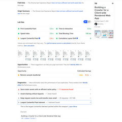
To see how your site is performing right now, you can use Pagespeed Insights. If your site has reasonable amount of traffic, it will also show metrics collected from real users. You can also find performance metrics in Chrome's devtools under the Lighthouse tab.
Now we know what to improve on, let's see the change I personally made to improve my scores.
The first improvement I made was to lazy load content such as images, videos, and ads. The way lazy loading works is it defers the rendering and fetching of content until the user has scrolled to a certain threshold.
There are a lot of lazy loading libraries out there, but I decided to build my own. The main idea is to listen to the window's scroll event and check if the user has scrolled to a certain threshold. Once the user has scrolled to that position, then we'll actually start fetching the content and rendering it on the page.
const componentOffsetTop = ref.current.offsetTop
const curYPosition = window.scrollY;
const offset = 500;

if (componentOffsetTop <= curYPosition + document.body.clientHeight + offset) {
    // render the component
}
Some browsers support lazy loading natively like Chrome. All you need to do is add loading="lazy" to your img tag like so.
<img src="image.png" loading="lazy" alt="…" width="200" height="200">
However, because not every single browser supports it, I ended up implementing my own solution. For my first pass, I used the following code to lazy load my images. FYI, all of these examples will be in React because my site is written in React.
const LazyLoadImage = (props) => {
    const ref = useRef(null);
    const [state, setState] = useState({
        loaded: false,
        src: null,
        shouldFetch: true,
    });

    const removeListeners = () => {
        window.removeEventListener("scroll", handleScroll);
    };

    const removeListenersCallback = useCallback(removeListeners);

    const loadImage = useCallback (() => {
        setState({
            ...state,
            src: props.src,
            shouldFetch: false,
            srcset: props.srcset,
            shouldStartLazyLoadAnimation: true,
        });
        removeListenersCallback();
    }, [state, removeListenersCallback, props]);

    const shouldLoadImage = useCallback((componentOffsetTop, userYPosition) => {
        return state.shouldFetch &&
        !state.loaded &&
        componentOffsetTop <= userYPosition + document.body.clientHeight + 500;
    }, [state]);

    const onImageLoad = () => {
        if (state.src === props.src) {
            setState({
                ...state,
                loaded: true,
            });
        }
    };

    const handleScroll = useCallback(debounce(() => {
        const yPosition = window.scrollY;
        if (shouldLoadImage(ref.current.offsetTop, yPosition)) {
            loadImage();
        }
    }, 100), [loadImage, shouldLoadImage]);

    useEffect(() => {
        const yPosition = window.scrollY;
        // Handles initial mount to check if image is already within threshold without scrolling.
        if (shouldLoadImage(ref.current.offsetTop, yPosition)) {
            loadImage();
        } else {
            window.addEventListener('scroll', handleScroll);
        }

        return () => {
            removeListenersCallback();
        };
    }, [shouldLoadImage, loadImage, handleScroll, removeListenersCallback]);

    const { src } = state;
    return (
        <img
            ref={ref}
            onLoad={onImageLoad}
            className={props.className}
            src={src}
            alt={props.alt}
            loading="lazy"
        />
    );
}
This Lazy Loading component defers process of fetching images and painting them onto the page, but this code will hurt your Cumulative Layout Shift. We'll look into how to fix that in the next section.
The main issue with the lazy loading component is that we don't know how much space the image will need to take up on the screen.
One way to work around this is to ensure all images have the same dimensions for the same component. A common pattern is to either ensure all the images have the same resolution and aspect ratio or to crop the image to make sure it fits in a fixed container.

However, this doesn't work for all use-cases. For example, my blog has images with various aspect ratios and orientations. Some images are in landscape and some are in portrait. A common practice is to use the following CSS for responsive images.
img {
    width: 100%;
    height: auto;
}
The issues with using height auto is that the browser doesn't know how much space to allocate until the image has been loaded. I got around this issue by adding some additional metadata to my images to preallocate the space without actually fetching the image. I added the expected width and height as a query parameter to the image.
/blogImages/chromebook_coding/cover-2.jpg?width=1742&height=1306
The query parameters contain both the width and height of the image so I know exactly how much space to allocate. Then in the Lazy Load Image component, I set the initial state of src with a placeholder svg using the width and height specified in the query params. This svg reserves the required space on the page before we fetch the image.
const placeholderSrc = (img) => {
    const { width, height } = img;
    return `data:image/svg+xml,%3Csvg xmlns="http://www.w3.org/2000/svg" viewBox="0 0 ${width} ${height}"%3E%3C/svg%3E`;
};

...

const [state, setState] = useState({
    loaded: false,
    src: placeholderSrc(props),
    ...
});
Now your Lazy Loaded image won't have any issues with shifted layouts!
Lastly, I started added a srcset to my images. Essentially this tells the browser to use a different sized dimension based on its size. You can customize it such that when using a mobile device, it'll fetch a lower resolution image and a non mobile device will use a higher resolution image. On this site, each image has 6 variations: width of 240px, width of 320px, width of 480px, width of 720px, width of 960px, and the original image. I use the lower resolution photos when I expect the image won't exceed a certain size. For example, on the homepage of Techwaifu.com, the images in the smaller article cards never exceed 300px, so I always use the 320px variation of the image.

When comparing the original image versus a shrunken variation of the image, you'll notice the original one will always take longer to download and is much larger to download. This is great for improving your site's performance since you won't need to fetch and render a 3200x2400 image on your 375x812 device.
Original Image | 299kB | 94ms to Download
Shrunken Image | 52.9kB | 47ms to Download
Now let's take a look at how this is done in the code. If you inspect an image on Techwaifu's blog, you'll notice there's two attributes on the image other than src: sizes and srcset.
The sizes attribute determines which image from the srcset should be used. It's pretty flexible since you can change the image to fetch based on the device size using max-width. Take a look at this article on srcset and sizes for an in-depth guide.
sizes="(max-width: 480px) 150px, 480px"
The srcset contains all the different sized images with the width the image should be used at.
srcset="/blogImages/ml_images/cover-240.jpg 240w, /blogImages/ml_images/cover-320.jpg 320w, /blogImages/ml_images/cover-480.jpg 480w, /blogImages/ml_images/cover-720.jpg 720w, /blogImages/ml_images/cover-960.jpg 960w"
Altogether, the image tag looks like this.
<img src="/blogImages/ml_images/cover-240.jpg" sizes="(max-width: 480px) 150px, 480px" srcset="/blogImages/ml_images/cover-240.jpg 240w, /blogImages/ml_images/cover-320.jpg 320w, /blogImages/ml_images/cover-480.jpg 480w, /blogImages/ml_images/cover-720.jpg 720w, /blogImages/ml_images/cover-960.jpg 960w">
It's pretty easy to generate all the various images using Sharp. Sharp can be used to resize images and even generate a webp variant. I used this code generate all the images at the different sizes.
const fs = require('fs');
const sharp = require('sharp');
const shell = require('shelljs');

const XXS_WIDTH = 240;
const XS_WIDTH = 320;
const S_WIDTH = 480;
const M_WIDTH = 720;
const L_WIDTH = 960;

const compressedSizes = [
    XXS_WIDTH,
    XS_WIDTH,
    S_WIDTH,
    M_WIDTH,
    L_WIDTH,
];

function resizeImages(imagePath) {
    compressedSizes.forEach(width => {
        const outPath = "out/" + imagePath.substring(0, imagePath.lastIndexOf("/"));
        // Create the folders for the output
        if (!fs.existsSync(outPath)) {
            shell.mkdir('-p', outPath);
        }

        // Generates jpg images
        const outPathWithSize = imagePath.substring(0, imagePath.indexOf(".")) + "-" + width;

        sharp(imagePath, {
            failOnError: false
        })
        .clone()
        .resize({ width: width })
        .toFile("out/" + outPathWithSize + ".jpg").catch(err => console.log(err));
    });
}
I also needed to update my Lazy Load component so the image will accept the srcset.
const LazyLoadImage = (props) => {
    const ref = useRef(null);
    const [state, setState] = useState({
        loaded: false,
        src: placeholderSrc(props),
        srcSet: null,
        shouldFetch: true,
    });

    const removeListeners = () => {
        window.removeEventListener("scroll", handleScroll);
    };

    const removeListenersCallback = useCallback(removeListeners);

    const loadImage = useCallback (() => {
        setState({
            ...state,
            src: props.src,
            shouldFetch: false,
            srcset: props.srcset,
        });
        removeListenersCallback();
    }, [state, removeListenersCallback, props]);

    const shouldLoadImage = useCallback((componentOffsetTop, userYPosition) => {
        return state.shouldFetch &&
        !state.loaded &&
        componentOffsetTop <= userYPosition + document.body.clientHeight + 500;
    }, [state]);

    const onImageLoad = () => {
        if (!state.loaded && state.src === props.src) {
            setState({
                ...state,
                loaded: true,
            });
        }
    };

    const onError = () => {
        setState({
            ...state,
            loaded: true
        });
        removeListeners();
    };

    const handleScroll = useCallback(debounce(() => {
        const yPosition = window.scrollY;
        if (shouldLoadImage(ref.current.offsetTop, yPosition)) {
            loadImage();
        }
    }, 100), [loadImage, shouldLoadImage]);

    useEffect(() => {
        const yPosition = window.scrollY;
        // Handles initial mount to check if image is already within threshold without scrolling.
        if (shouldLoadImage(ref.current.offsetTop, yPosition)) {
            loadImage();
        } else {
            window.addEventListener('scroll', handleScroll);
        }

        return () => {
            removeListenersCallback();
        };
    }, [shouldLoadImage, loadImage, handleScroll, removeListenersCallback]);

    const { loaded, src, srcset  } = state;
    const { sizes } = props;
    return (
        <img
            ref={ref}
            onLoad={onImageLoad}
            onError={onError}
            className={props.className}
            src={src}
            srcSet={srcset}
            sizes={sizes}
            alt={props.alt}
            loading="lazy"
        />
    );
}
Congrats! Now you have a Lazy Loaded Image that supports different sized images using srcset.
I primarily worked on optimizing the images on my site because images are usually the largest contentful item on each blog post. Using this lazy loaded component with the placeholder helped reduce my CLS from > 0.10 to 0. Lazy loading also reduced the initial render since the browser didn't have to paint all the images at once. Using srcsets also optimized how large each network request as well. I would recommend recommend looking at web.dev to see their recommendations for improving site performance as well. Be sure to track your site's performance over time using PageSpeed Insights. Every time I made a change, I verified the before and after performance on that site to verify it really is an improvement. What changes have you made to your site to account for Google's algorithm change? Let me know in the comments section below and check out The Best Chromebooks for Programming in 2020 to find your next laptop.


